Lavari Jewelers
Premium Brand Identity for Lavari Jewelers

Project Brief
Lavari Jewelers needed a visual identity that could carry a fine jewelry catalog across packaging, print, and digital. The existing brand was inconsistent, hard to read at small sizes, and missing source files, which made it nearly impossible to apply the same way twice. We designed a quiet luxury system built to scale, then extended it into a full storefront design direction.
Creative Challenge
Fine jewelry is an intimate, high consideration purchase, and the brand had to feel considered enough to match what was inside the box. The old identity worked against that. Marks were applied inconsistently, typography lost legibility at the sizes jewelry branding actually lives at, and without source files, every new application meant rebuilding from scratch.
The deeper challenge was scale. A logo can look beautiful in isolation and fall apart across a dense product catalog, a printed box, a business card, and a product page. The system needed one set of rules that held up in all of them, while staying quiet enough to let the product lead.
Approach
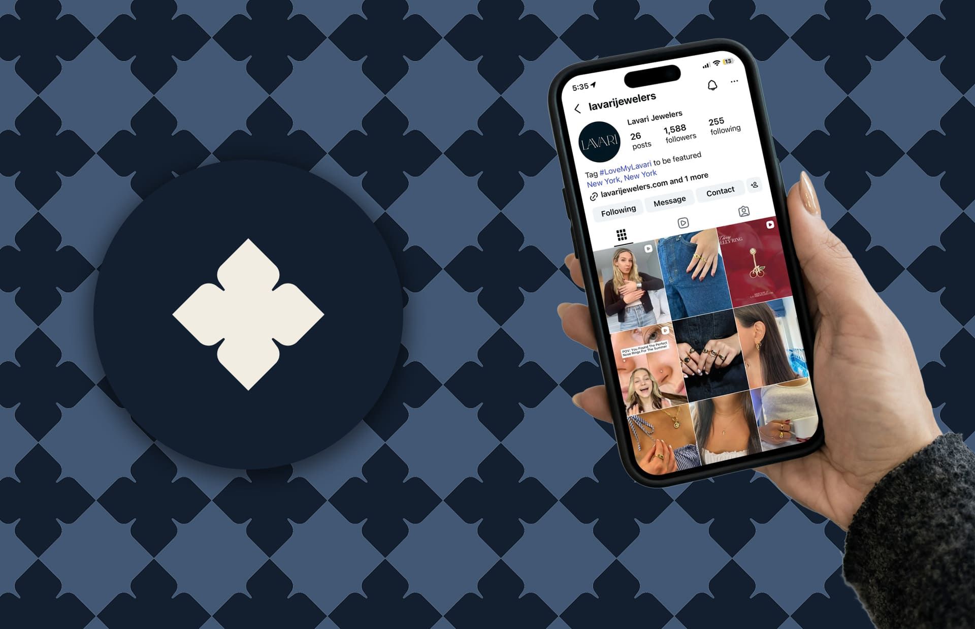
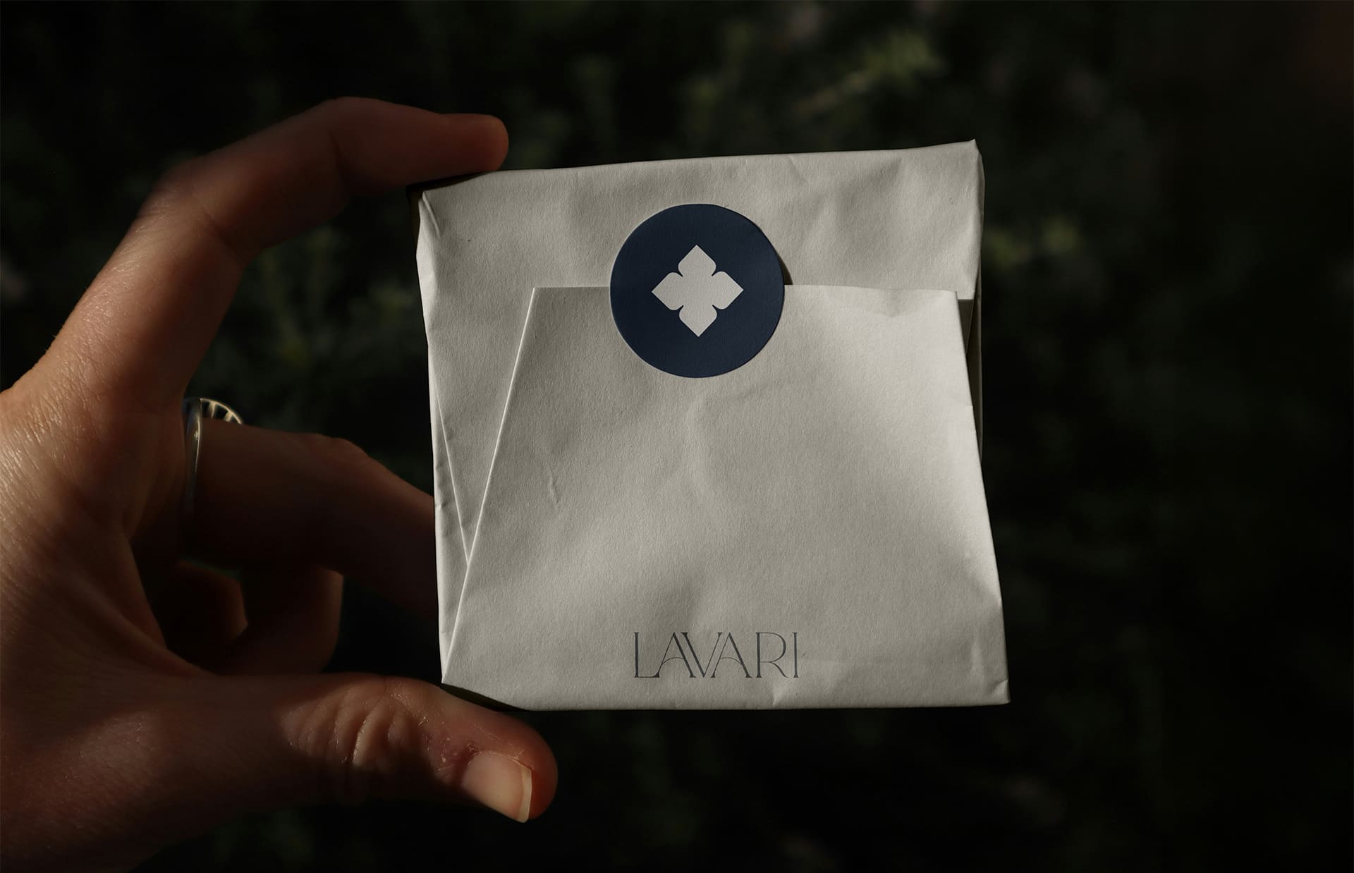
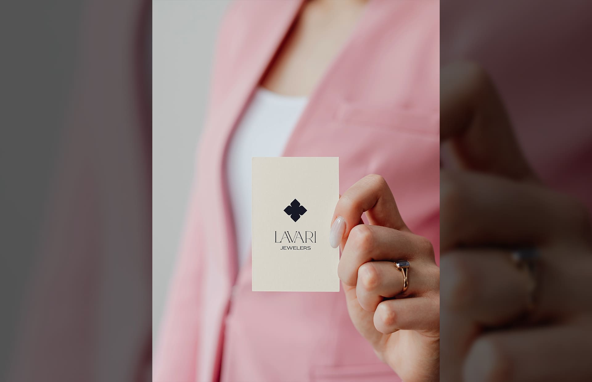
- Logo suite: Designed a custom wordmark paired with a floral inspired submark, built to stay legible and confident from packaging to social avatars.
- Color palette: Developed a "Blue Sapphire" palette of navy, pearl, sapphire, ivory, and blue topaz to signal trust and craftsmanship without shouting.
- Typography: Established a refined hierarchy that keeps product details clear and the brand voice calm across long and short form applications.
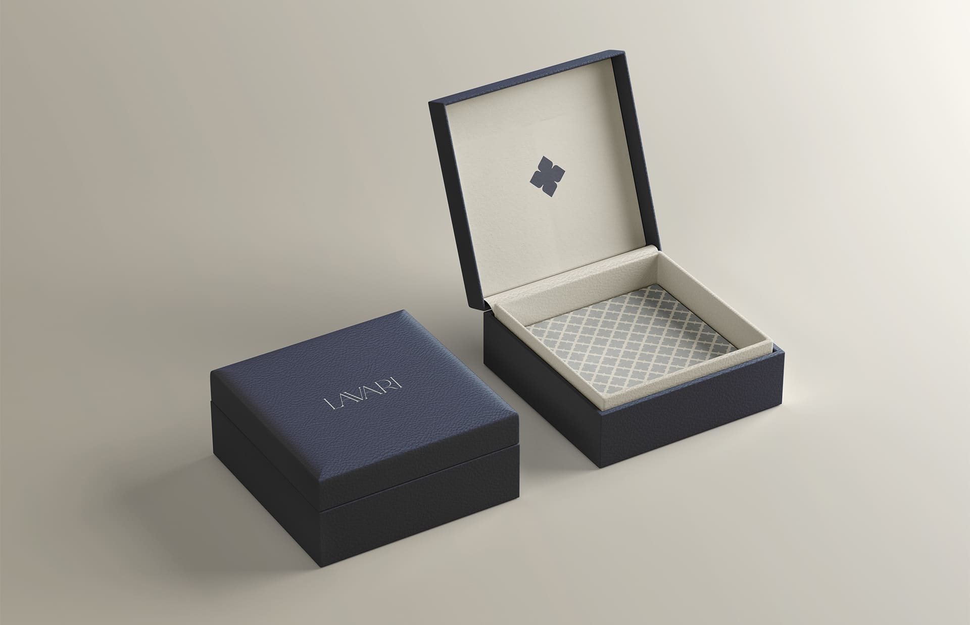
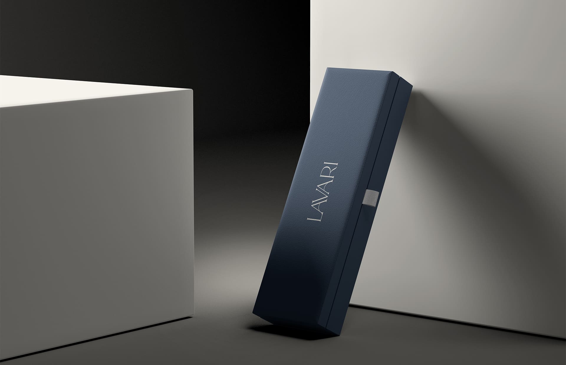
- Pattern and print system: Created pattern assets for packaging and print, including a custom branded jewelry box and supporting collateral.
- Photography direction: Set art direction that keeps the product feeling intimate, tactile, and premium.
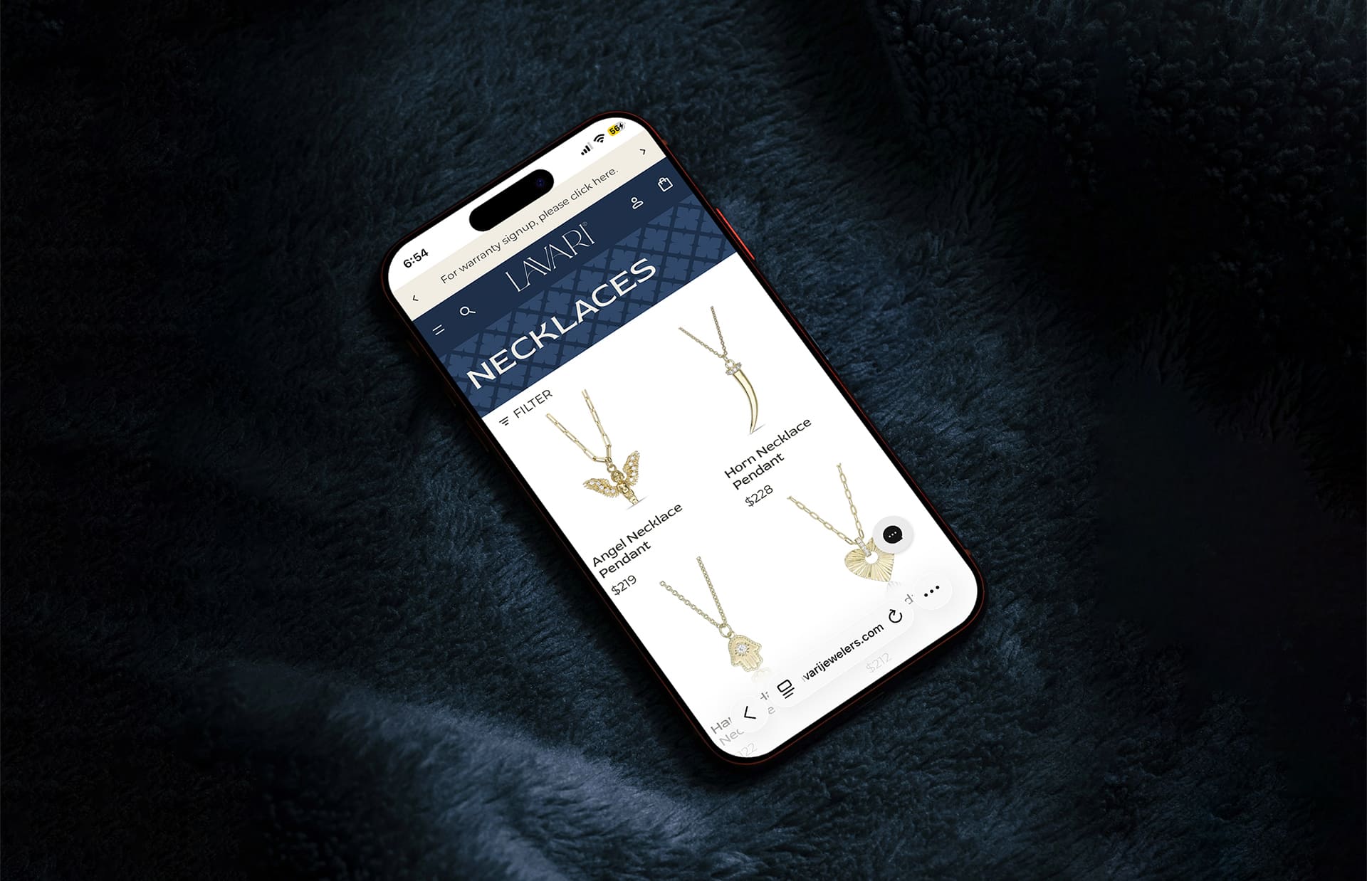
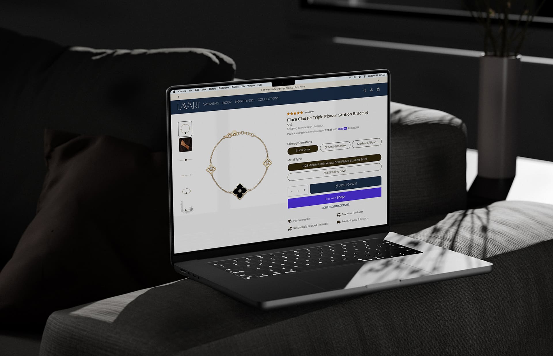
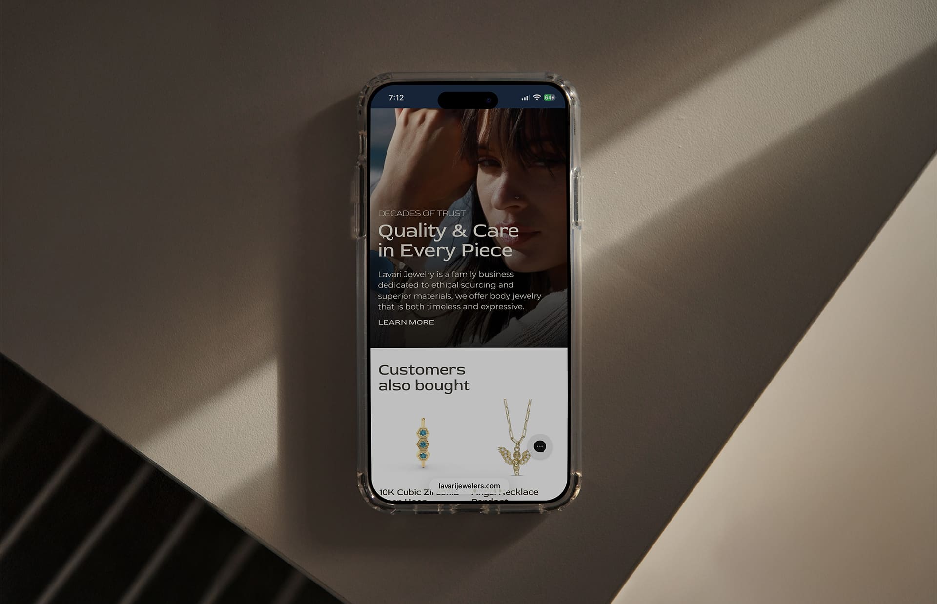
- Digital application: Designed a storefront direction that carried the same marks, palette, and type hierarchy into a full browsing and product experience, proving the system worked at web scale and density.
What We Delivered
A complete quiet luxury identity system: logo suite, color palette, typography hierarchy, pattern assets, photography direction, and packaging application, delivered with organized source files so the brand can be applied consistently without rebuilding it each time. The system was then extended into a storefront design direction covering navigation, collection browsing, and product page structure.
Looking for a brand system that holds up across packaging, print, and digital? Let's talk.